
 by Hollis Hiscock
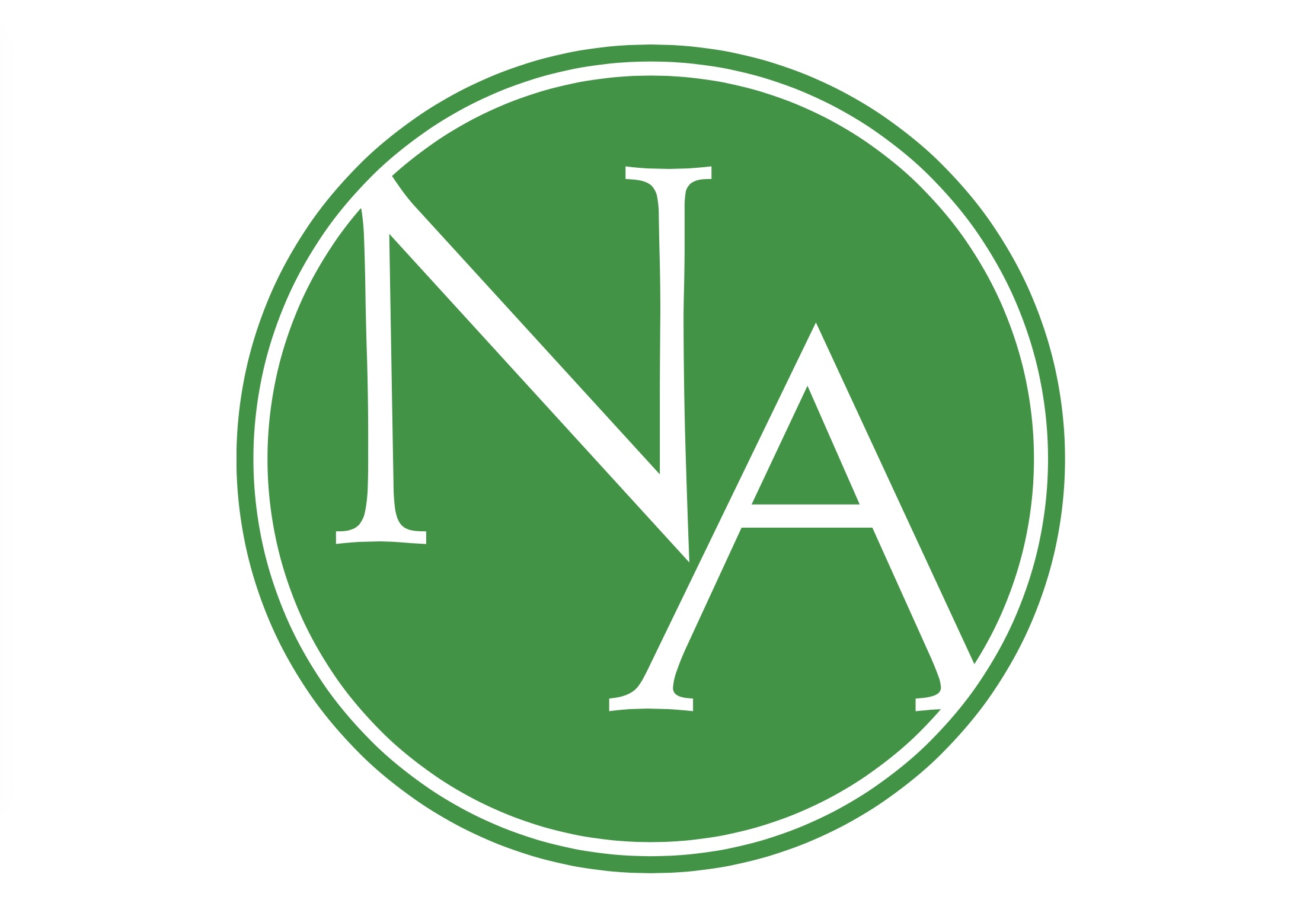
At a recent meeting, the Niagara Anglican Publication Board accepted a new logo, probably the first distinctive design for the diocesan paper in its 62 year history.
Like beauty, any explanation of a logo may be in the eye of the beholder, yet I am venturing into uncharted waters to provide my interpretation. No doubt you may perceive it differently, and I look forward to hearing what you glean from reflecting on our new insignia.
The outer circle incorporates everything inside as God encompasses humanity, nature and universal totality. It speaks of universality, wholeness, eternity and sacredness.
The white circle, separating the two green spheres, can be interpreted as the demarcation line between humanity and divinity.
The inside circle with NA (Niagara Anglican) reminds us that as a diocesan paper we are “a gathering place and sounding board for the people of the Diocese of Niagara” and we invite others to participate digitally, as well as through print.
The colour white symbolizes goodness, light, heaven, understanding, faith, beginning, goodness and other visions we strife to achieve in our relationships with each other, nature and God.
The colour green reminds us of our constant need to grow, be renewed, live in harmony, care for the environment, be respectful and practice other behaviours leading to the well-being of all.
Well, that is what I see when I look at our new logo. What do you see?
If none of the above resonates with you, I hope you like it anyway.
Contemplation in Chaos