
New colours and designs rolled out for social media, website, and print
After months of planning and consultations, the diocese is receiving a visual makeover, complete with a new logo for its social media platforms, a refreshed homepage of its website, and a reimagined letterhead template.
“We’re really excited to unveil our new and modern designs,” says Archdeacon Bill Mous, executive officer and secretary of synod. “More than ever, a person’s first impression of our diocese comes from an online engagement; the new look speaks about a faith community that is vibrant and inviting and inclusive.”
The design process began shortly after the new diocesan Mission Action Plan was approved by synod council as a way of symbolically signaling the new diocesan vision and direction, with its guiding statement: Called to Life – Compelled to Love. A new graphic with these words will help keep the vision at the forefront of the minds of Niagara Anglicans.

Response from members of synod council focused on the transformational impact of diocesan ministries. “We heard that when we talk about making change in the world, we are inclusive, faithful, compassionate, and leadership-driven,” says Archdeacon Mous.
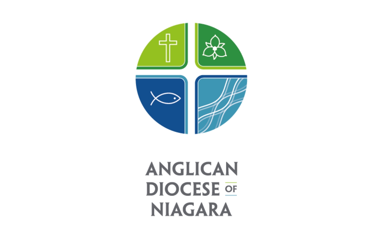
The new colours, styles, and fonts seek to embody these attributes in the creative vision of the project. Living colours, greens and blues, were inspired by the dynamic landscapes found across the diocese and to link back to our established diocesan colours.
The refresh of the diocesan website home page will reflect these new colours while also making the news and events components more accessible, without as much scrolling required. The People in the News web page, among the site’s most visited pages, will find a new location as the first item in the news section.
One of the other motivations for the project was the growing importance, even before the pandemic began, of online and social media engagement. “We felt we needed a fresh creative approach, if only from a design perspective, to allow more flexibility with digital communication channels,” notes Archdeacon Mous. “Facebook and Twitter profile images, for instance, are designed to be circular and don’t intuitively work with the shape of our diocesan coat of arms.”
For the new social media logo, mission, community, and inclusivity inspired the design. The central cross, for instance, is unbounded and open. Several recognizable symbols were also used to root the design in our Christian tradition. A trillium was also included as a way of connecting the image to the diocesan coat of arms which features the flower prominently.
“The refresh represents a new and modern look, one which will help the wider world to identify our diocese and the vital ministry we undertake each day in the many communities we serve.”
Contemplation in Chaos